


My reasoning was rather like this:Originally Posted by CrazyForDex

Anchor= Ferry
S= South
S + Anchor= Southferry= Southperry
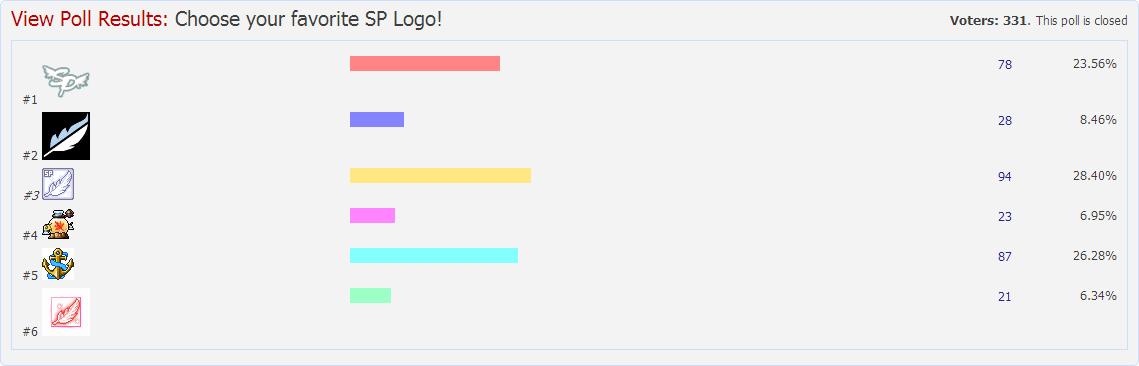
Speaking as someone that has dabbled a bit with those kind of icons though, I think that design stands out the most after #3 and it looks pleasant enough on its own without looking horrible in the normal format or looking a tad faded out. As for the blue and white, I'd prefer that the new logo incorporated those colours but hey, innovation's good too.

 Reply With Quote


 about this post


Bookmarks